
在如今的大数据时代,数据的一个特性就是维度高,如一个电商平台中商品的信息就高达上百个维度,一幅图像的维度就是像素点的个数,高达上百到上万。而人类最直观的是理解二维空间中的数据,这就需要将高维的数据可视化,从直觉上去感受数据的分布情况等。
因此高维数据可视化,需要将高维的数据降到二维,最简单的算法是主成分分析(PCA)。下面讲解的是目前主流的数据降维算法 t-SNE (t-distributed Stochastic Neighbor Embedding),最原始的论文如下高维数据可视化,目前学术界也有一些相关的研究。
t-SNE 算法的相关介绍可参考如下网站:
An illustrated introduction to the t-SNE algorithm
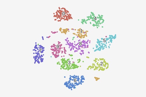
t-SNE 算法的应用需要基于这样的假设:尽管现实世界中看到的数据都是分布在高维空间中的,但是都具有很低的内在维度。也就是说高维数据经过降维后,在低维状态下更能显示出其本质特性。这就是流行学习的基本思想,也称为非线性降维。
下面介绍基于 python 的 t-SNE 算法的使用,t-SNE 算法已经被集成到了 sklearn 包中。
# -*- coding: utf-8 -*-
import numpy as np
from sklearn.manifold import TSNE
# Random state.
RS = 20180101
import matplotlib.pyplot as plt
import matplotlib.patheffects as PathEffects
# We import seaborn to make nice plots.
import seaborn as sns
sns.set_style('darkgrid')
sns.set_palette('muted')
sns.set_context("notebook", font_scale=1.5,
                rc={"lines.linewidth": 2.5})
def scatter(x, colors):
    # We choose a color palette with seaborn.
    palette = np.array(sns.color_palette("hls", 10))
    # We create a scatter plot.
    f = plt.figure(figsize=(8, 8))
    ax = plt.subplot(aspect='equal')
    sc = ax.scatter(x[:,0], x[:,1], lw=0, s=20,
                    c=palette[colors.astype(np.int)])
    plt.xlim(-25, 25)
    plt.ylim(-25, 25)
    ax.axis('off')
    ax.axis('tight')
    # We add the labels for each digit.
    txts = []
    for i in range(3):
        # Position of each label.
        xtext, ytext = np.median(x[colors == i, :], axis=0)
        txt = ax.text(xtext, ytext, str(i), fontsize=34)
        txt.set_path_effects([
            PathEffects.Stroke(linewidth=5, foreground="w"),
            PathEffects.Normal()])
        txts.append(txt)
    return f,
试看结束,如继续查看请付费↓↓↓↓
打赏0.5元才能查看本内容,立即打赏
来源【首席数据官】,更多内容/合作请关注「辉声辉语」公众号,送10G营销资料!
版权声明:本文内容来源互联网整理,该文观点仅代表作者本人。本站仅提供信息存储空间服务,不拥有所有权,不承担相关法律责任。如发现本站有涉嫌抄袭侵权/违法违规的内容, 请发送邮件至 jkhui22@126.com举报,一经查实,本站将立刻删除。